Brand Identity
Kids Cancer Connection is a non-profit organization that was in need of a new brand identity. They stated that their previous branding was outdated and did not properly represent the brand’s values and goals. This project involved designing a new logo, developing a new color palette, redesigning the website homepage, creating business cards and stationery items, applying the logo across various applications, and producing a comprehensive brand book that clearly explains the brand’s new identity.
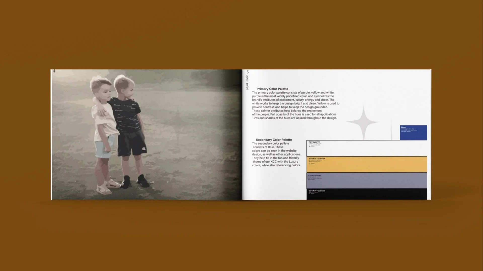
Applications used: Adobe Illustrator, Adobe InDesign, and Adobe Photoshop.
More Things to learn about
-

Stationary System
Business Card,LetterHead, and more
-

Package Design
Package
-

Application
Product
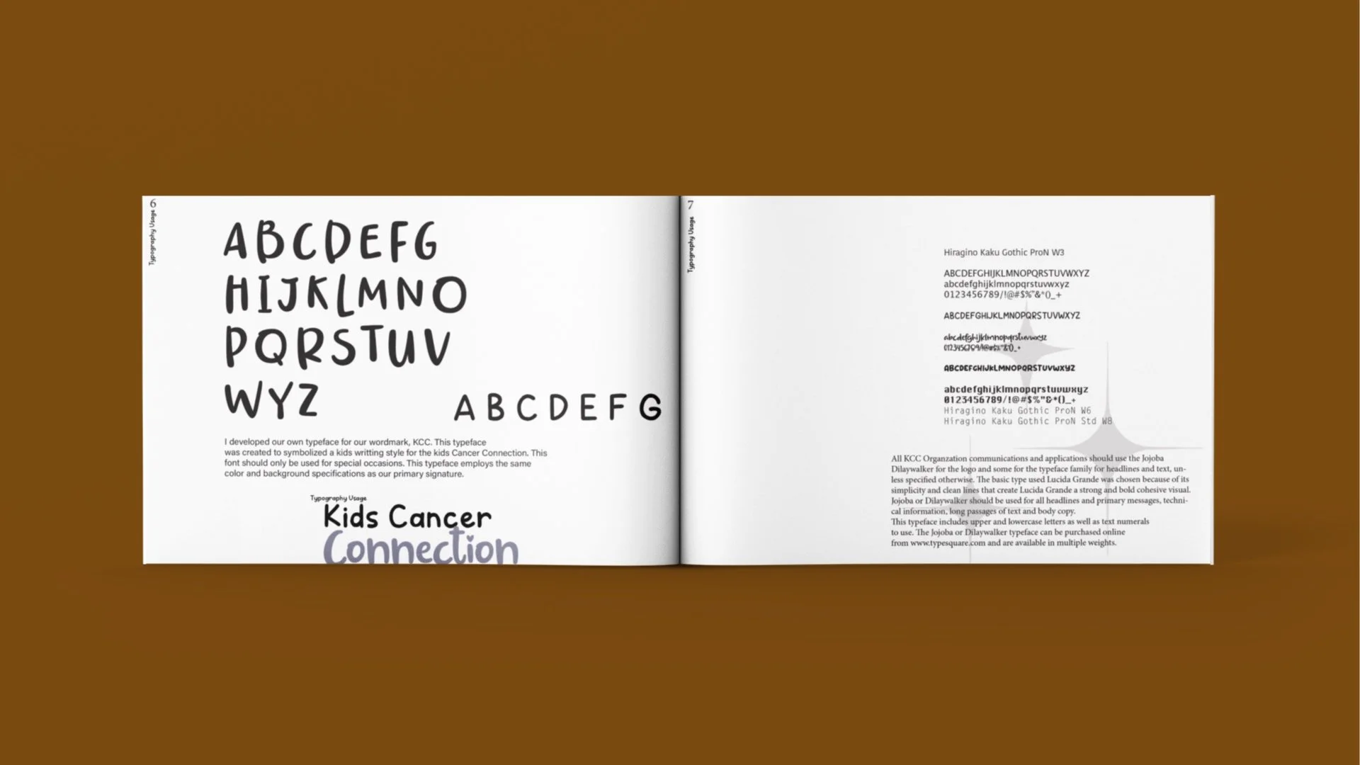
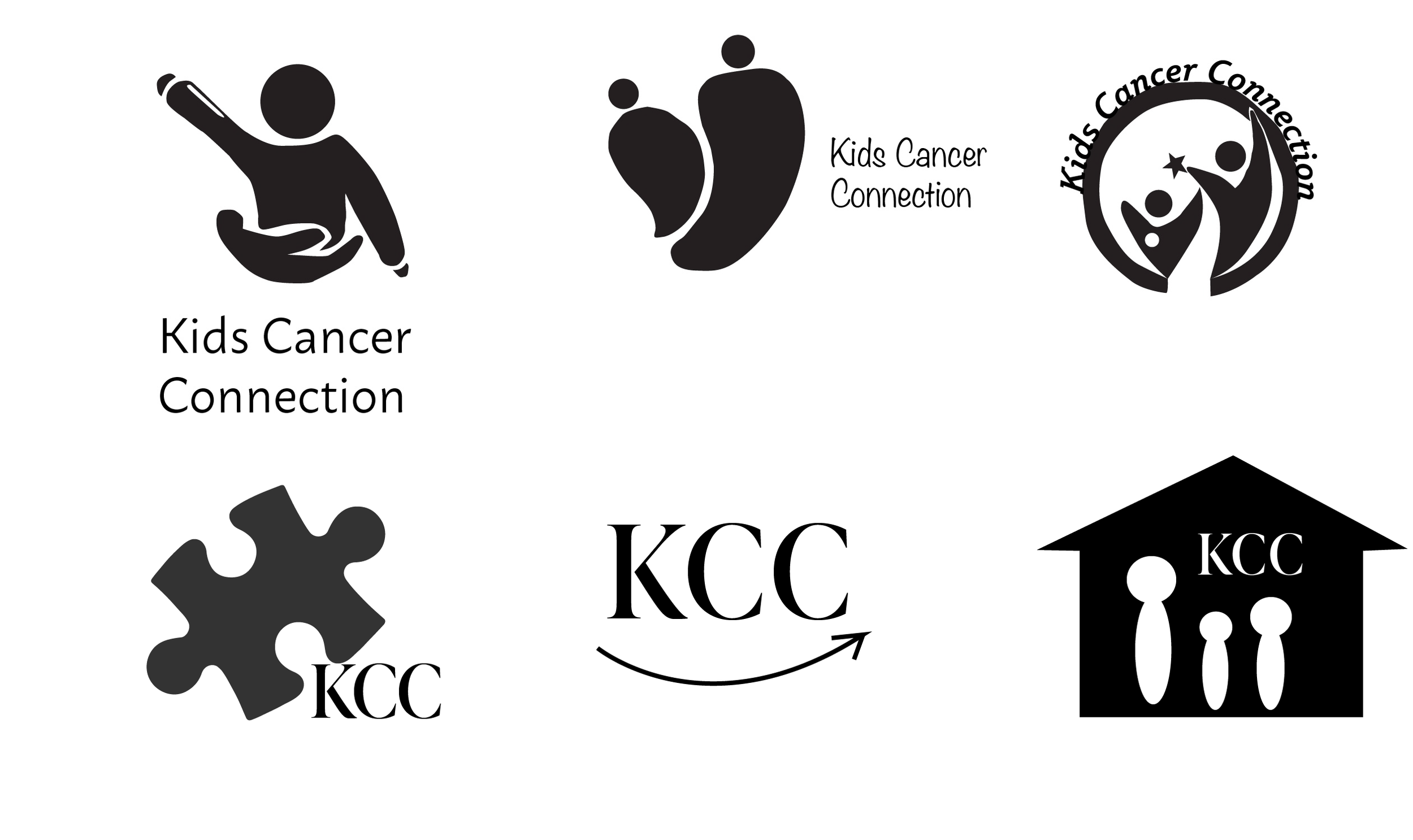
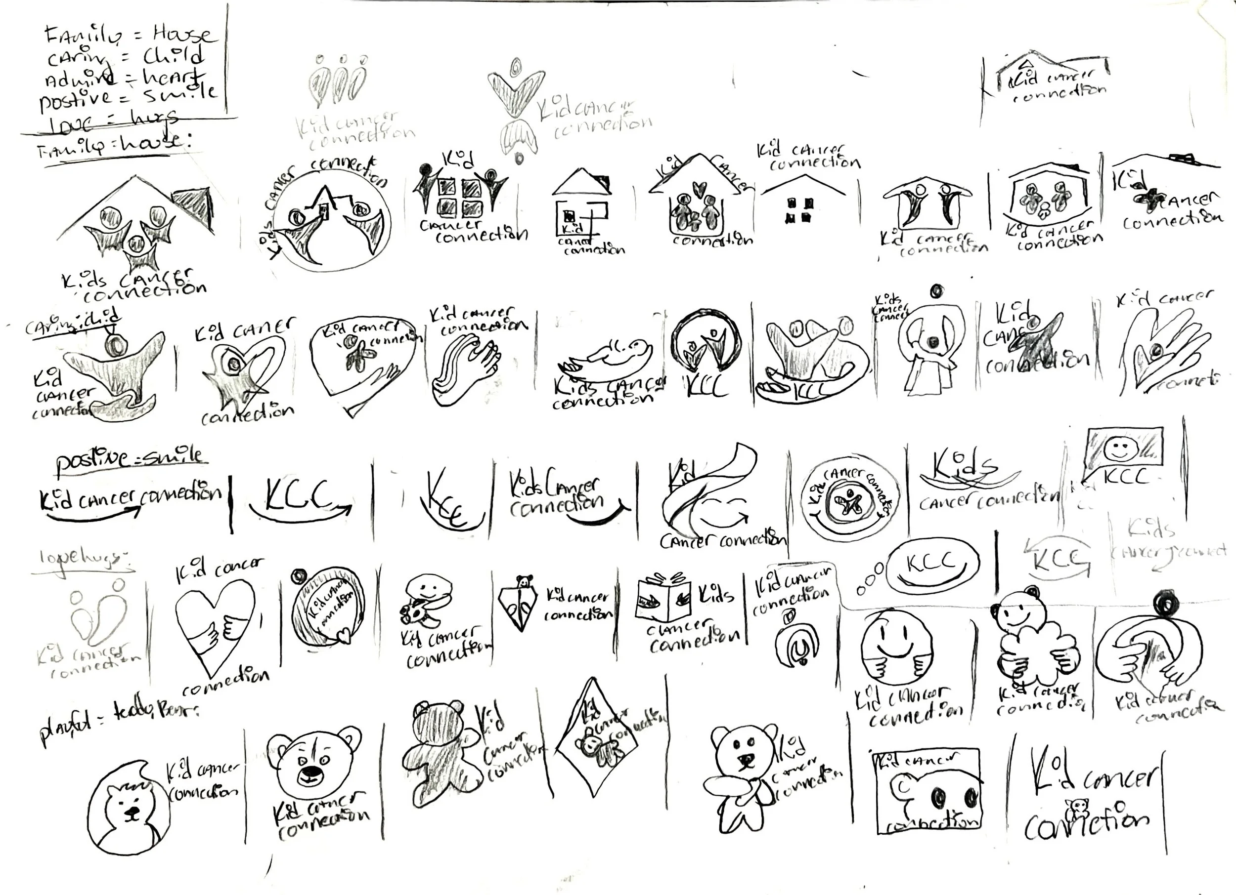
Logos Process.
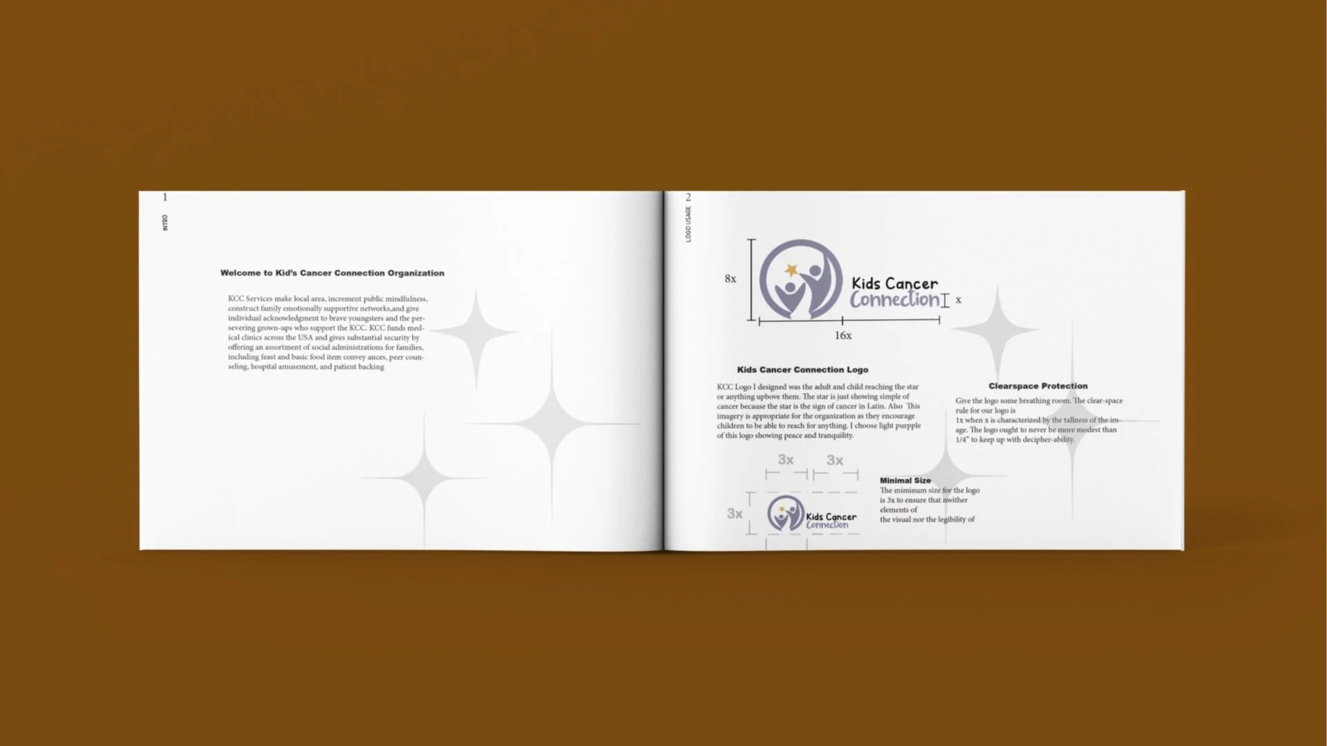
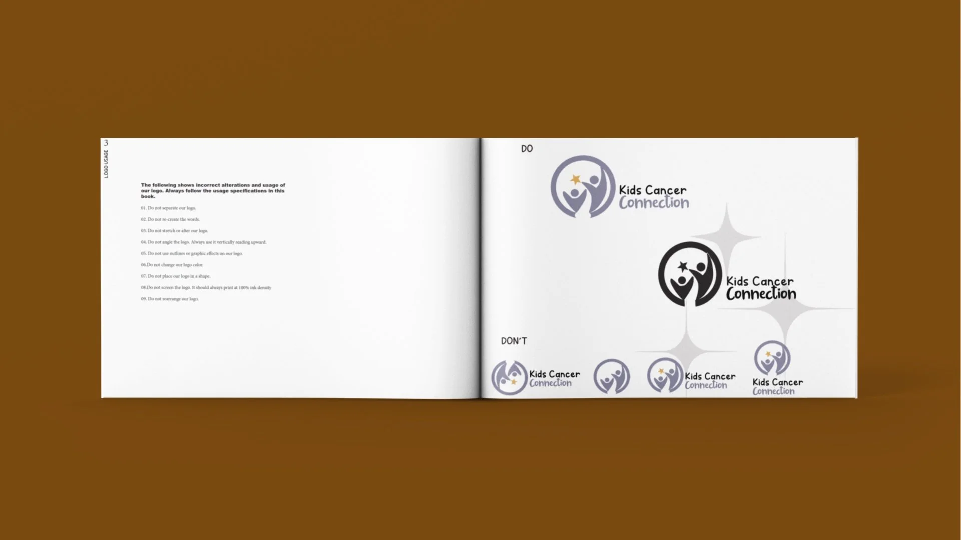
The new KCC logo I designed features an adult and child reaching for a star, symbolizing hope and aspiration. The star represents cancer, as it is the zodiac sign associated with cancer in Latin. This imagery is fitting for the organization, as it reflects their mission to inspire children to reach for their dreams. I chose light purple for the logo because it conveys peace and tranquility.
Eventually, this project pushed my limits and challenged me to create my most comprehensive brand identity to date. It was an incredible opportunity to explore new ideas and expand my skill set.

In 2021, the challenge was to create a brand identity for the non-profit organization Kids Cancer Connection, which, as the name suggests, supports families and children affected by cancer. It was an exciting opportunity to transform the brand and develop a more modern look that appeals to all ages.


More information read here